Do You See What I See?
Posted by John Friel on Dec 31st 2018
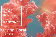
Describing a color is like naming shapes in the clouds: No two viewers see exactly the same thing. A beautiful example: Living Coral, the Pantone Color of the Year for 2019.
Coral pink with gold undertones, Living Coral conjures a range of impressions. What do you see? Sunsets? Apricots? Umbrella drinks?
With its trademark enthusiasm, Pantone sees it as “nurturing... sociable and spirited.” It’s a “convivial” hue that “provides comfort and buoyancy.”
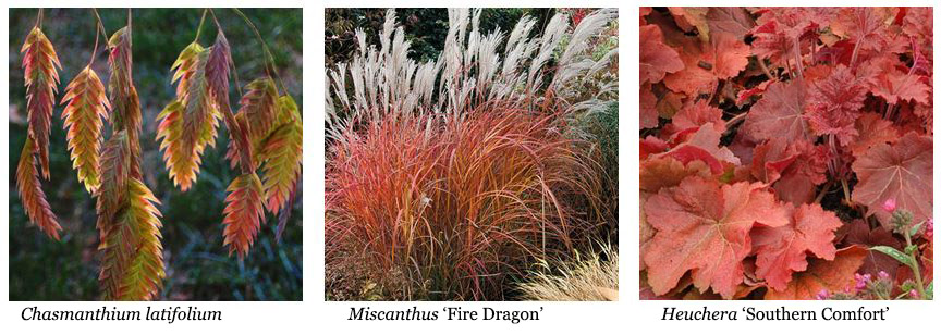
What do we see? Flowers and foliage. We’re funny that way. Here are a few of our favorite things that will play beautifully with the Color of the Year.
Chasmanthium latifolium is an easy-to-grow native. Attractive dangling seedheads take on glowing coral/red tones in fall. Zones 5-9.
Miscanthus ‘Fire Dragon’ makes a graceful late-season segue from green through coral, ending in a flourish of reds and oranges. Zones 6-9.
Heuchera ‘Southern Comfort’: The coral bell mavens at Terra Nova created this beauty’s big, cinnamon/peach leaves. A bold foliage statement, hardy in Zones 4-9.

However YOU see Living Coral, you’ll want to grow what harmonizes with it. Why? Because it’ll be everywhere, in fashion, interior and exterior decor, and more. And garden center customers will be looking for plants that rhyme with it.
Give the people what they want. Grow living color that goes with Living Coral (no snorkel required) in vigorous liners from Emerald Coast Growers – the easy choice!

